
Case Study 02
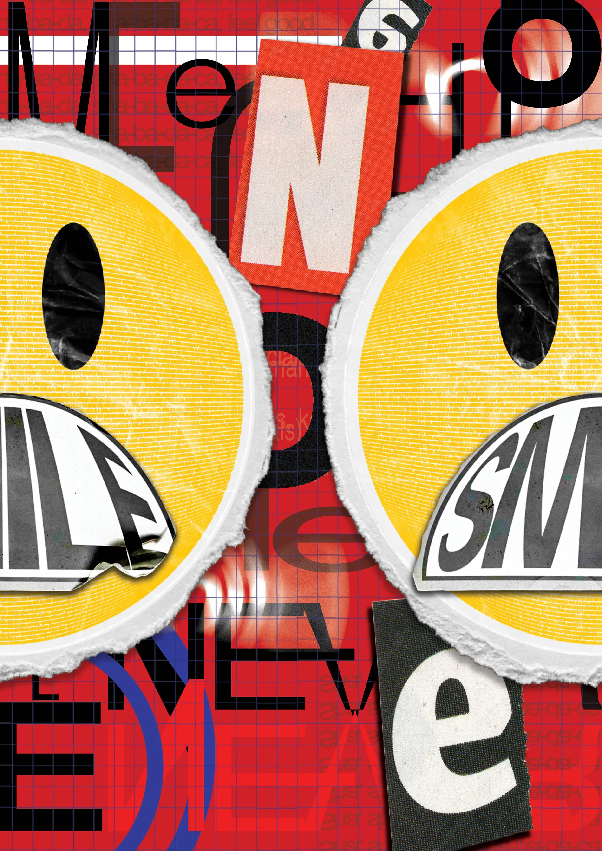
A melancholy town where we never smile.
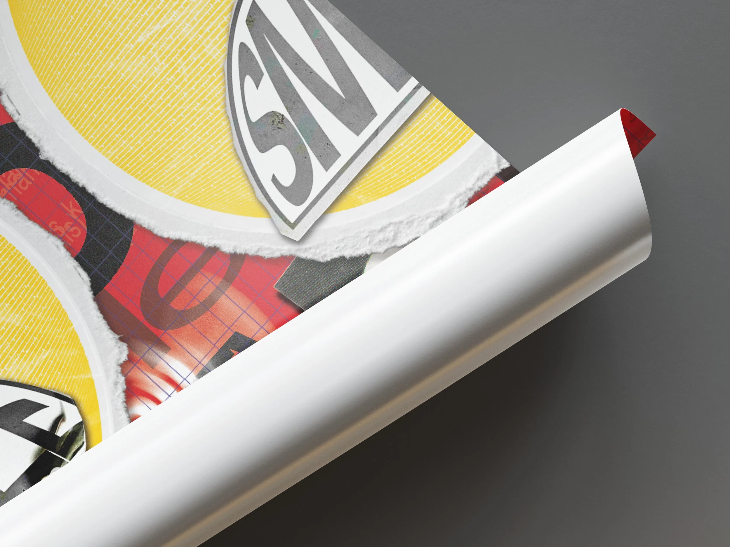
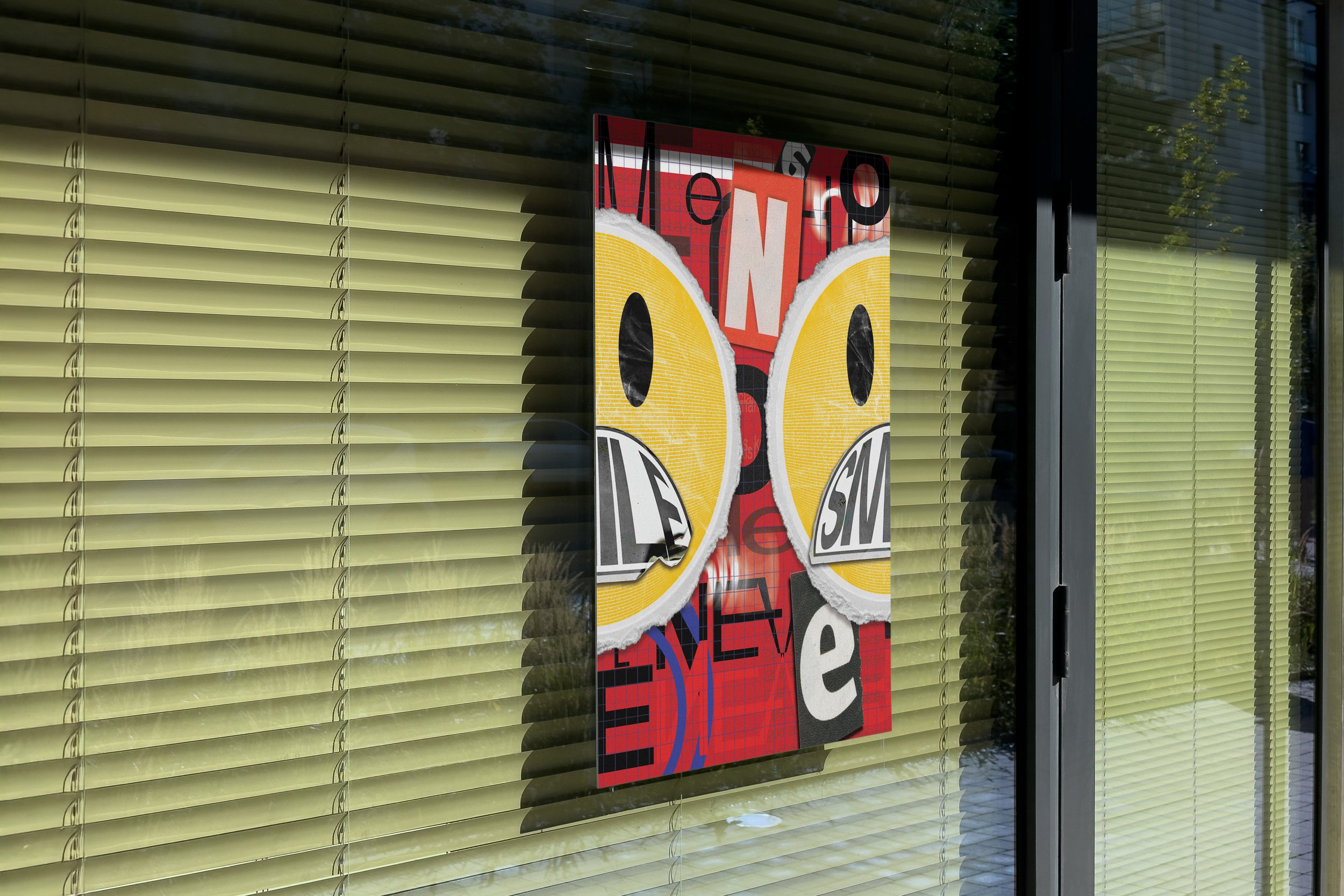
An expressive typography poster. Combining impactful lyrics with a style influenced by a designer, The Godfather of Grunge - David Carson, who has inspired me.

Overview
This 4-week project explored how a song lyric with personal meaning could be transformed into an expressive poster. I focused on translating emotion into a visual form while experimenting with expressive typography, new Adobe tools, and design techniques. Inspired by the work of David Carson, I used his grunge-inspired style to shape the visual direction of the project.
The Challenge
The goal was to choose a song I connected with personally and create a poster that captured both the emotions of the lyric and my own response to it.
Research & Insights
My research centred on understanding the meaning behind the song and its creators, Gorillaz and Damon Albarn. The lyric “A Melancholy Town Where We Never Smile” reflects a dystopian, consumer-driven society where genuine emotion has been lost, which became the core concept of the poster.
I also studied David Carson’s work to better understand his approach to typography, layout, and visual expression, using those insights to inform my design decisions.
Design Process
Throughout the project, I experimented with blur effects and other tools I hadn't used before to create a gritty, distressed aesthetic. I aimed to capture both the visual identity of Gorillaz and the raw, unconventional style that Carson became known for through Ray Gun magazine.
Conclusion
This project showed me how much depth can exist behind the media we consume. By researching the lyrics, the artists, and David Carson’s work, I gained a stronger understanding of how design can communicate emotion and meaning.
The project also sparked a growing interest in music-related design. It left me wondering: could expressive typography posters be used in concert spaces to create an emotional connection before a performance even begins? Could a lyric that deeply resonates with fans make the concert experience even more memorable through visual design?